Table of Contents
Get source code for this RMarkdown script here.
Consider being a patron and supporting my work?
Donate and become a patron: If you find value in what I do and have learned something from my site, please consider becoming a patron. It takes me many hours to research, learn, and put together tutorials. Your support really matters.
Load packages/libraries
Use library() to load packages at the top of each R script.
library(tidyverse); library(data.table)
library(lme4); library(lmerTest); library(ggbeeswarm)
library(hausekeep)
Read data from folder/directory into R
Read in data from a csv file (stored in “./data/simpsonsParadox.csv”). Right-click to download and save the data here. You can also use the fread() function to read and download it directly from the URL (see code below).
df1 <- fread("data/simpsonsParadox.csv") # data.table

# or download data directly from URL
url <- "https://raw.githubusercontent.com/hauselin/rtutorialsite/master/data/simpsonsParadox.csv"
df1 <- fread(url)

df1
          iq  grades class
 1:  94.5128 67.9295     a
 2:  95.4359 82.5449     a
 3:  97.7949 69.0833     a
 4:  98.1026 83.3141     a
 5:  96.5641 99.0833     a
 6: 101.5897 89.8526     a
 7: 100.8718 73.6987     a
 8:  97.0769 47.9295     a
 9:  94.2051 55.6218     a
10:  94.4103 44.4679     a
11: 103.7436 74.0833     b
12: 102.8205 59.8526     b
13: 101.5897 47.9295     b
14: 105.3846 44.8526     b
15: 106.4103 60.2372     b
16: 109.4872 64.8526     b
17: 107.2308 74.4679     b
18: 107.2308 49.8526     b
19: 102.1026 37.9295     b
20: 100.0513 54.8526     b
21: 111.0256 56.0064     c
22: 114.7179 56.0064     c
23: 112.2564 46.3910     c
24: 108.6667 43.6987     c
25: 110.5128 36.3910     c
26: 114.1026 30.2372     c
27: 115.0256 39.4679     c
28: 118.7179 51.0064     c
29: 112.8718 64.0833     c
30: 118.0000 55.3000     c
31: 116.9744 17.5449     d
32: 121.1795 35.2372     d
33: 117.6923 29.8526     d
34: 121.8974 18.3141     d
35: 123.6410 29.4679     d
36: 121.3846 53.6987     d
37: 123.7436 63.6987     d
38: 124.7692 48.6987     d
39: 124.8718 38.3141     d
40: 127.6410 51.7756     d
          iq  grades class
glimpse(df1)
Rows: 40
Columns: 3
$ iq     <dbl> 94.5128, 95.4359, 97.7949, 98.1026, 96.5641, 101.5897, 100.871…
$ grades <dbl> 67.9295, 82.5449, 69.0833, 83.3141, 99.0833, 89.8526, 73.6987,…
$ class  <chr> "a", "a", "a", "a", "a", "a", "a", "a", "a", "a", "b", "b", "b…
ggplot2 basics: layering
ggplot2 produces figures by adding layers one at a time. New layers are added using the + sign. The first line is the first/bottom-most layer, and second line is on top of the bottom layer, and third line is on top of the second layer, and the last line of code is the top-most layer.
See official documentation here.
Note: ggplot prefers long-form (tidy) data.
Layer 1: specify data object, axes, and grouping variables
Use ggplot function (not ggplot2, which is the name of the library, not a function!). Plot iq on x-axis and grades on y-axis.
ggplot(data = df1, aes(x = iq, y = grades)) # see Plots panel (empty plot with correct axis labels)
Subsequent layers: add data points and everything else
ggplot(df1, aes(iq, grades)) + # also works without specifying data, x, and y
    geom_point() # add points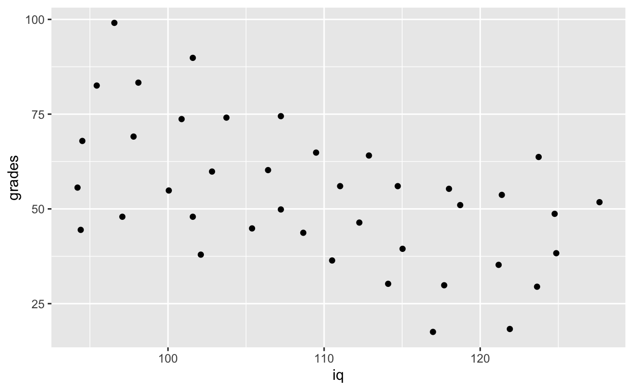
Each time you want to know more about a ggplot2 function, google ggplot2 function_name to see official documentation and examples and learn those examples! That’s usually how we plot figures. Even Hadley Wickham, the creator of tidyverse and many many cool things in R refers to his own online documentations all the time. There are way too many things for everyone to remember, and we usually just look them up on the internet whenever we need to use them (e.g., google ggplot2 geom point).
You’ll use geom_point() most frequently to add points to your plots. Check out the official documentation for geom_point here.
ggplot(df1, aes(iq, grades)) +
    geom_point(size = 8, col = 'green') + # change size and colour
    labs(y = "Exam grades (0 to 100)", x = "Intelligence (IQ)") # rename axes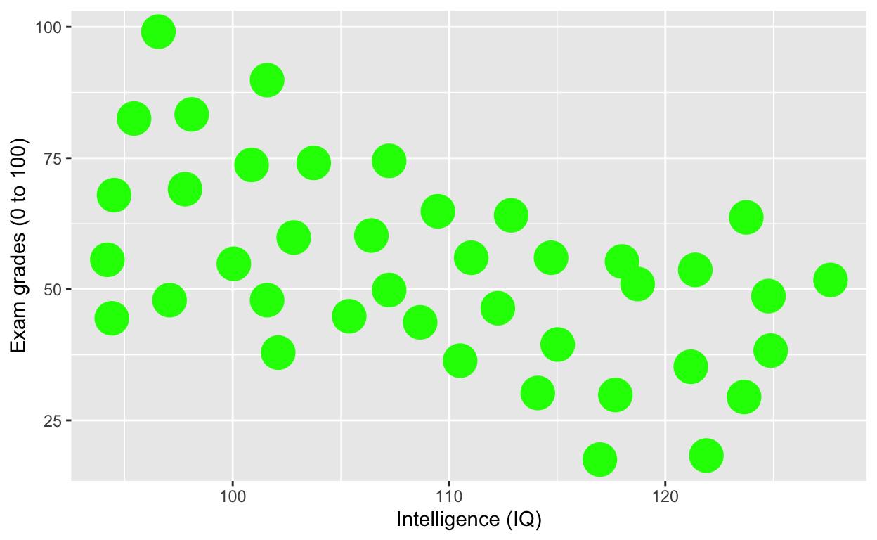
ggplot(df1, aes(iq, grades)) +
    geom_point(size = 3, col = 'blue') + # change size and colour
    labs(y = "Exam grades (0 to 100)", x = "Intelligence (IQ)") + # rename axes
    scale_y_continuous(limits = c(0, 100), breaks = c(0, 20, 40, 60, 80, 100)) + # y axis limits/range (0, 100), break points
    scale_x_continuous(limits = c(90, 130)) # x axis limits/range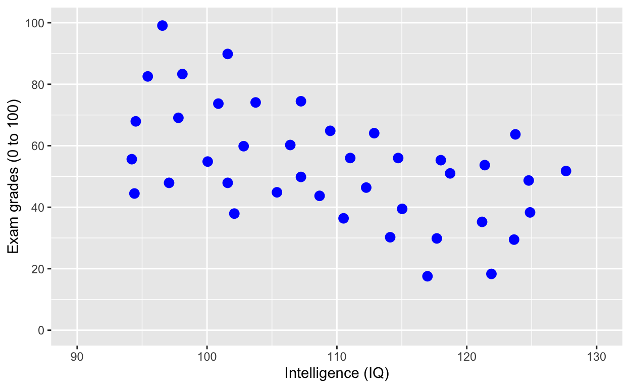
Save the plot as an object
plot1 <- ggplot(df1, aes(iq, grades)) +
    geom_point(size = 3, col = 'red') + # change size and colour
    labs(y = "Exam grades (0 to 100)", x = "Intelligence (IQ)") + # rename axes
    scale_y_continuous(limits = c(0, 100), breaks = c(0, 20, 40, 60, 80, 100)) + # y axis limits/range (0, 100), break points
    scale_x_continuous(limits = c(90, 130)) # x axis limits/range
plot1 # print plot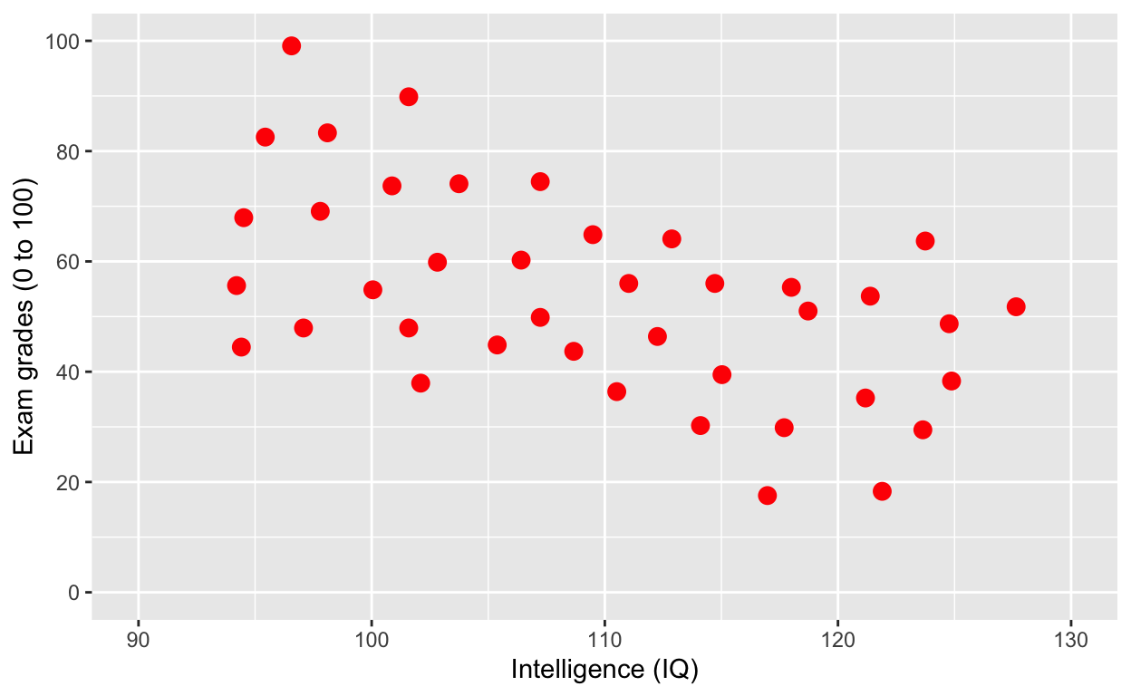
Save a plot to your directory
Save to Figures directory, assuming this directory/folder already exists. You can also change the width/height of your figure and dpi (resolution/quality) of your figure (since journals often expect around 300 dpi).
ggsave(plot1, './Figures/iq_grades.png', width = 10, heigth = 10, dpi = 100)Add line of best fit
plot1 +
    geom_smooth() # fit line to data (defaults loess smoothing)
Same as above
ggplot(df1, aes(iq, grades)) +
    geom_point(size = 3, col = 'red') + # change size and colour
    labs(y = "Exam grades (0 to 100)", x = "Intelligence (IQ)") + # rename axes
    scale_y_continuous(limits = c(0, 100), breaks = c(0, 20, 40, 60, 80, 100)) + # y axis limits/range (0, 100), break points
    scale_x_continuous(limits = c(90, 130)) + # x axis limits/range
    geom_smooth()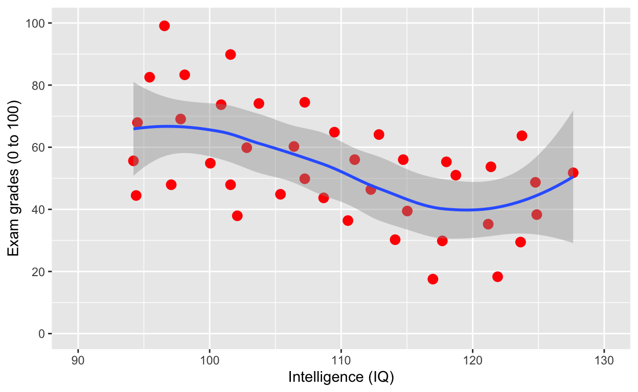
Note that the smooth (i.e., the line of best fit) is on top of the dots, because of layering. Let’s add the line first, then use geom_point(). What do you think will happen?
ggplot(df1, aes(iq, grades)) +
    geom_smooth(size = 2) +
    geom_point(size = 3, col = 'red') + # change size and colour
    labs(y = "Exam grades (0 to 100)", x = "Intelligence (IQ)", title = 'Changed layers') + # rename axes
    scale_y_continuous(limits = c(0, 100), breaks = c(0, 20, 40, 60, 80, 100)) + # y axis limits/range (0, 100), break points
scale_x_continuous(limits = c(90, 130))# x axis limits/range 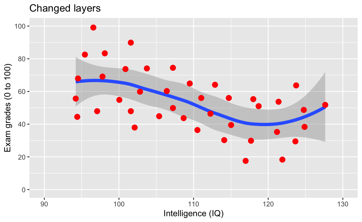
Note that now the points are above the line. Also, I’ve added a title via the labs() line.
ggplot(df1, aes(iq, grades)) +
    geom_point(size = 3, col = 'red') + # change size and colour
    labs(y = "Exam grades (0 to 100)", x = "Intelligence (IQ)") + # rename axes
    scale_y_continuous(limits = c(0, 100), breaks = c(0, 20, 40, 60, 80, 100)) + # y axis limits/range (0, 100), break points
    scale_x_continuous(limits = c(90, 130)) + # x axis limits/range
    geom_smooth(method = 'lm', se = F, col = 'black') # fit linear regression line, remove standard error, black line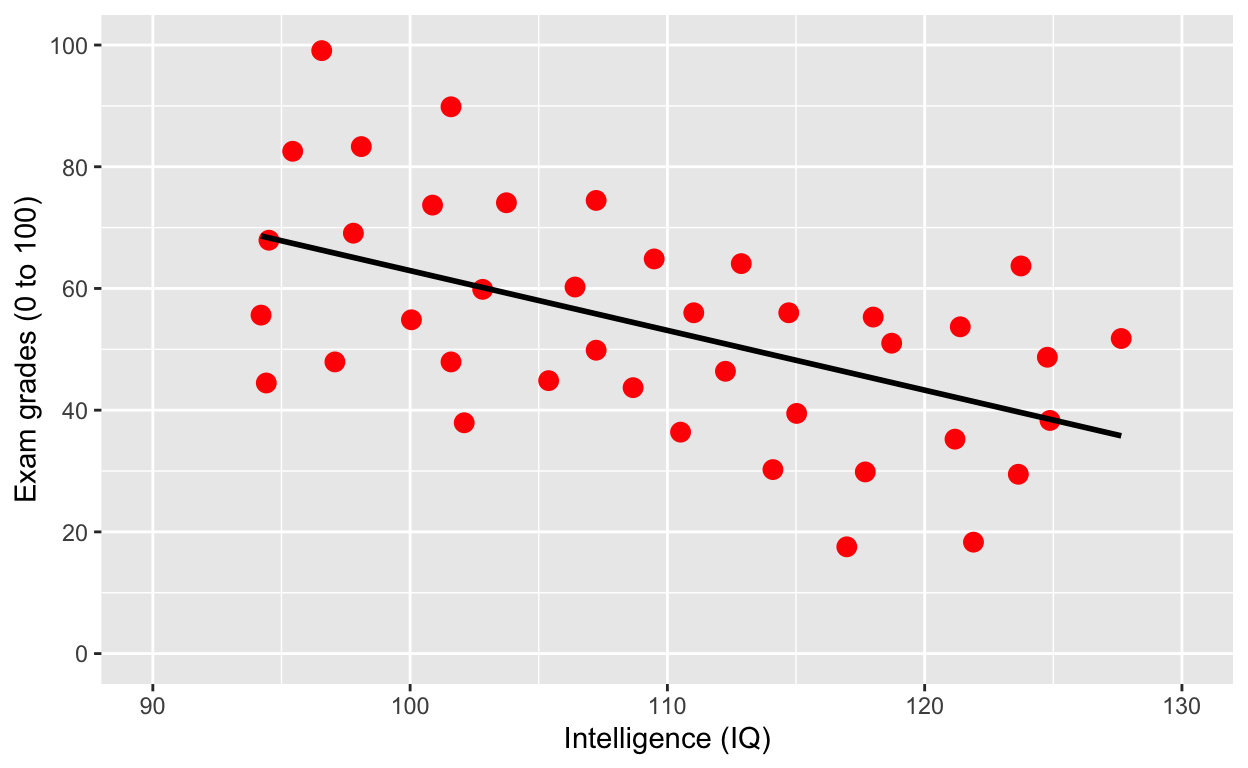
Why is IQ negatively correlated with grades?
Grouping
Use col to specify grouping variable
Note what’s new in the first line/layer to add grouping.
ggplot(df1, aes(iq, grades, col = class)) +
    geom_point(size = 3) + # change size and colour
    labs(y = "Exam grades (0 to 100)", x = "Intelligence (IQ)") + # rename axes
    scale_y_continuous(limits = c(0, 100), breaks = c(0, 20, 40, 60, 80, 100)) + # y axis limits/range (0, 100), break points
    scale_x_continuous(limits = c(90, 130)) + # x axis limits/range
geom_smooth(method = 'lm', se = F) # fit linear regression line 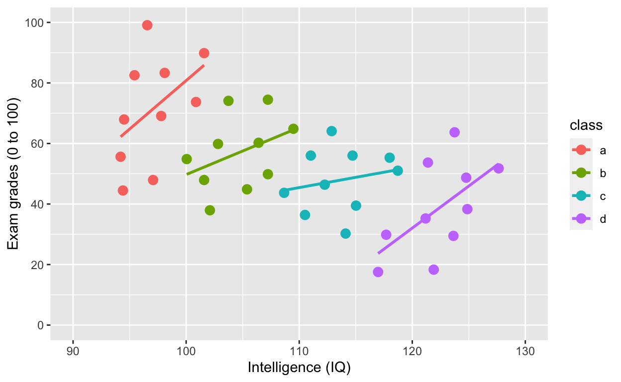
ggplot(df1, aes(iq, grades, col = class)) specifies the data to plot df1, x-axis iq, y-axis grades, and to give different colours to different groups col = class, where class refers to the grouping variable in the dataset.
What is the relationship between IQ and grades within each class now? What happened?!?
Use shape to specify grouping variable
ggplot(df1, aes(iq, grades, shape = class)) +
    geom_point(size = 3) + # change size and colour
    labs(y = "Exam grades (0 to 100)", x = "Intelligence (IQ)") + # rename axes
    scale_y_continuous(limits = c(0, 100), breaks = c(0, 20, 40, 60, 80, 100)) + # y axis limits/range (0, 100), break points
    scale_x_continuous(limits = c(90, 130)) + # x axis limits/range
geom_smooth(method = 'lm', se = F) # fit linear regression line 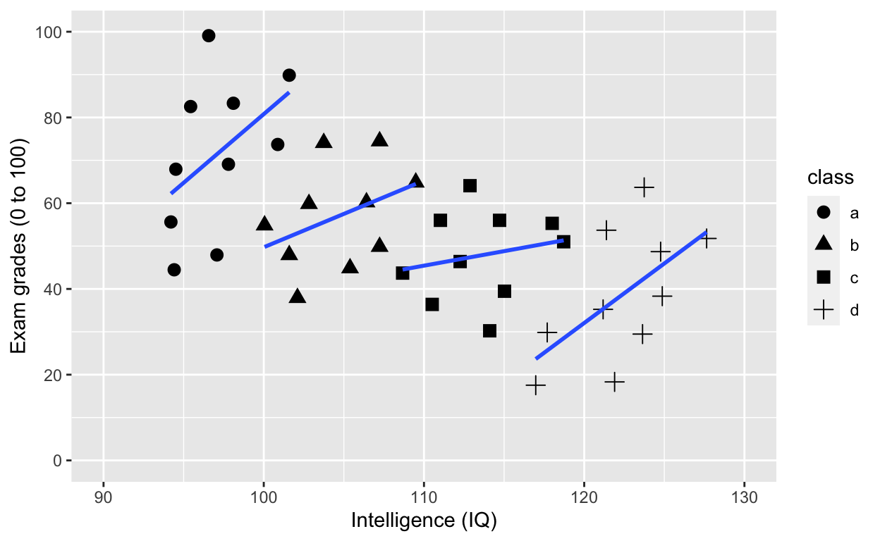
Adding an overall line of best fit while ignoring class
ggplot(df1, aes(iq, grades, col = class)) +
    geom_point(size = 3) + # change size and colour
    labs(y = "Exam grades (0 to 100)", x = "Intelligence (IQ)") + # rename axes
    scale_y_continuous(limits = c(0, 100), breaks = c(0, 20, 40, 60, 80, 100)) + # y axis limits/range (0, 100), break points
    scale_x_continuous(limits = c(90, 130)) + # x axis limits/range
geom_smooth(method = 'lm', se = F, aes(group = 1)) # fit linear regression line 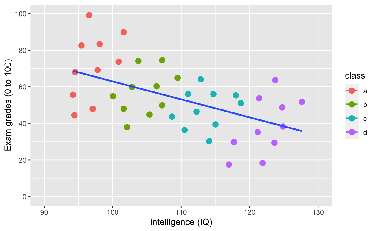
Adding an overall line of best fit AND separate lines for each group
plot2 <- ggplot(df1, aes(iq, grades, col = class)) +
    geom_point(size = 3) + # change size and colour
    labs(y = "Exam grades (0 to 100)", x = "Intelligence (IQ)") + # rename axes
    scale_y_continuous(limits = c(0, 100), breaks = c(0, 20, 40, 60, 80, 100)) + # y axis limits/range (0, 100), break points
    scale_x_continuous(limits = c(90, 130)) + # x axis limits/range
    geom_smooth(method = 'lm', se = F) + # fit linear regression line
    geom_smooth(method = 'lm', se = F, aes(group = 1))
plot2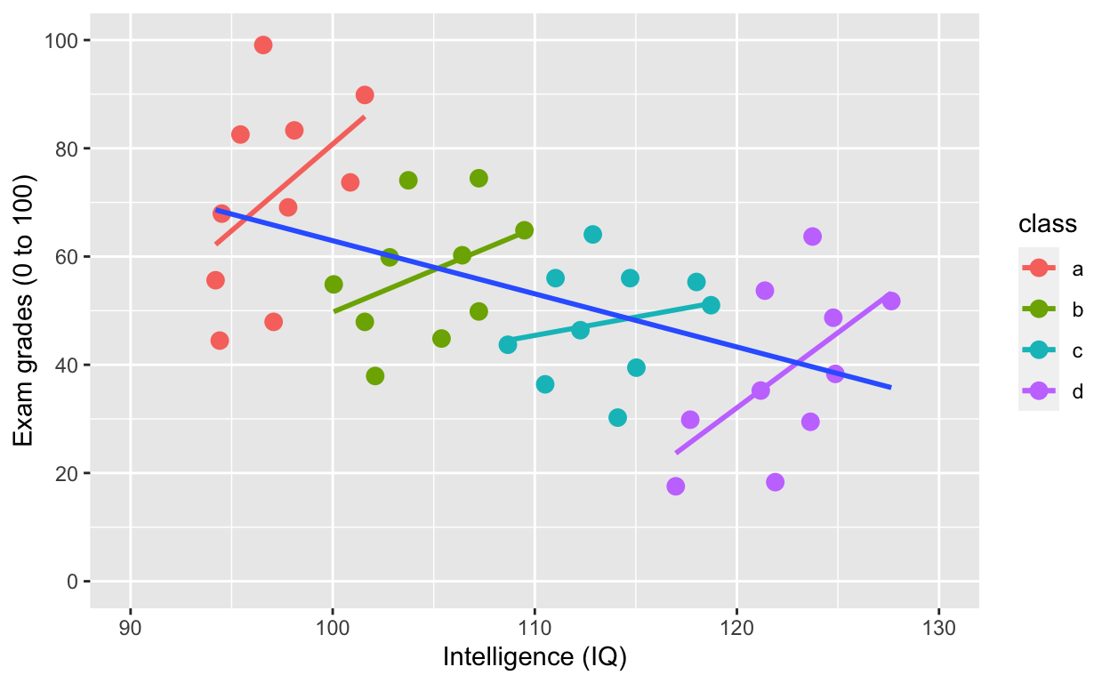
Simpson’s paradox: Negative overall relationship, but positive relationship within each class.
Plotting histograms, boxplots, and violinplots
Histogram
ggplot(df1, aes(iq)) +
    geom_histogram()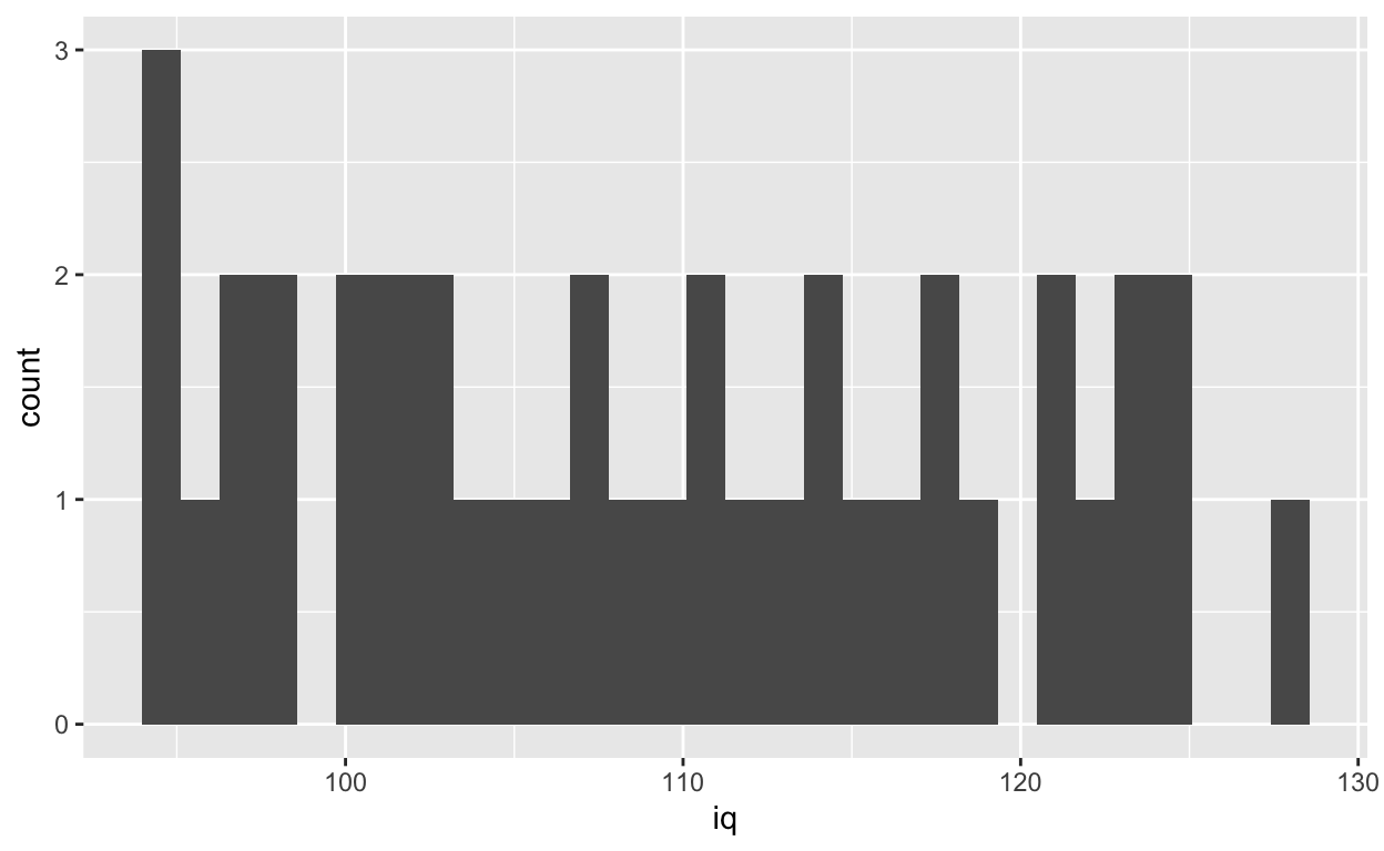
Specifying binwidth
ggplot(df1, aes(iq)) +
    geom_histogram(binwidth = 5)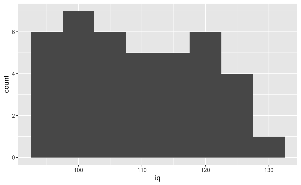
Density plot
ggplot(df1, aes(iq)) +
    geom_density()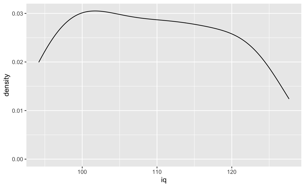
Boxplot for each class
ggplot(df1, aes(class, grades)) +
    geom_boxplot()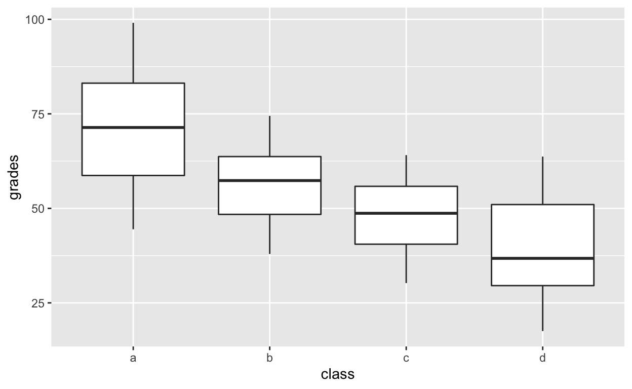
Violinplot for each class
ggplot(df1, aes(class, grades)) +
    geom_violin()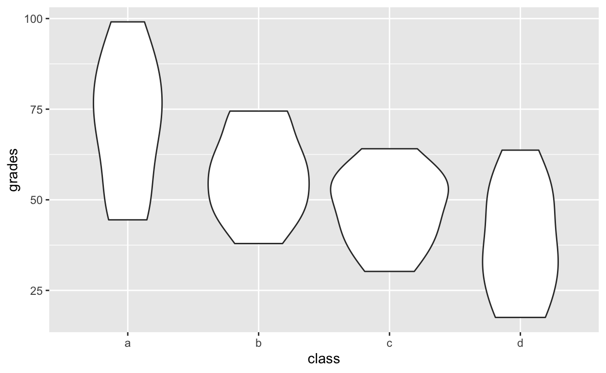
Layering and colouring plots
ggplot(df1, aes(class, grades, col = class)) +
    geom_violin() +
    geom_boxplot() +
    geom_point()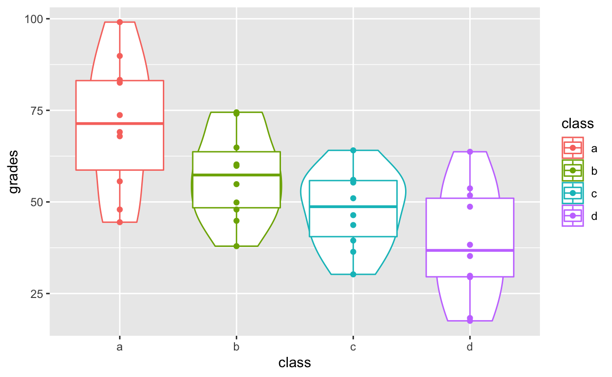
Distribution of points with geom_quasirandom()
An alternative that I prefer more than both boxplots and violin plots: geom_quasirandom() from the ggbeeswarm package. See here for more information.
geom_quasirandom() extends geom_point() by showing the distribution information at the same time. It basically combines all the good things in geom_boxplot, geom_violin, geom_point and geom_histogram.
ggplot(df1, aes(class, grades, col = class)) +
    geom_quasirandom()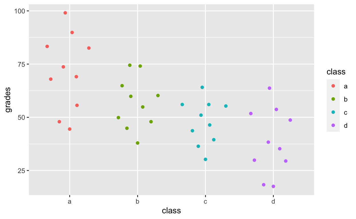
df1$overallClass <- "one_class" # create variable that assigns everyone to one class
# df1[, overallClass := "one_class"] # data.table syntax for the line above
geom_quasirandom shows distribution information!
ggplot(df1, aes(overallClass, grades)) + # y: grades
    geom_quasirandom()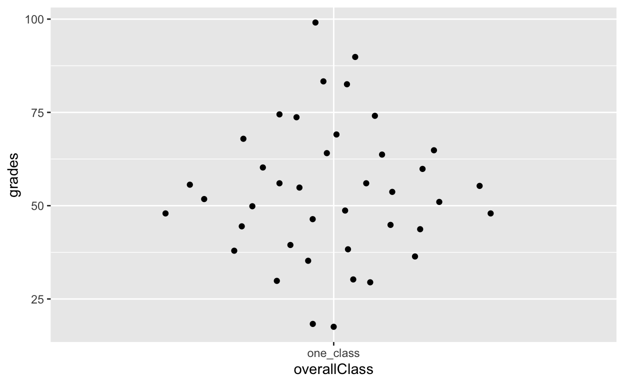
ggplot(df1, aes(overallClass, iq)) + # y: iq
    geom_quasirandom() +
    labs(x = "") # remove x-axis label (compare with above)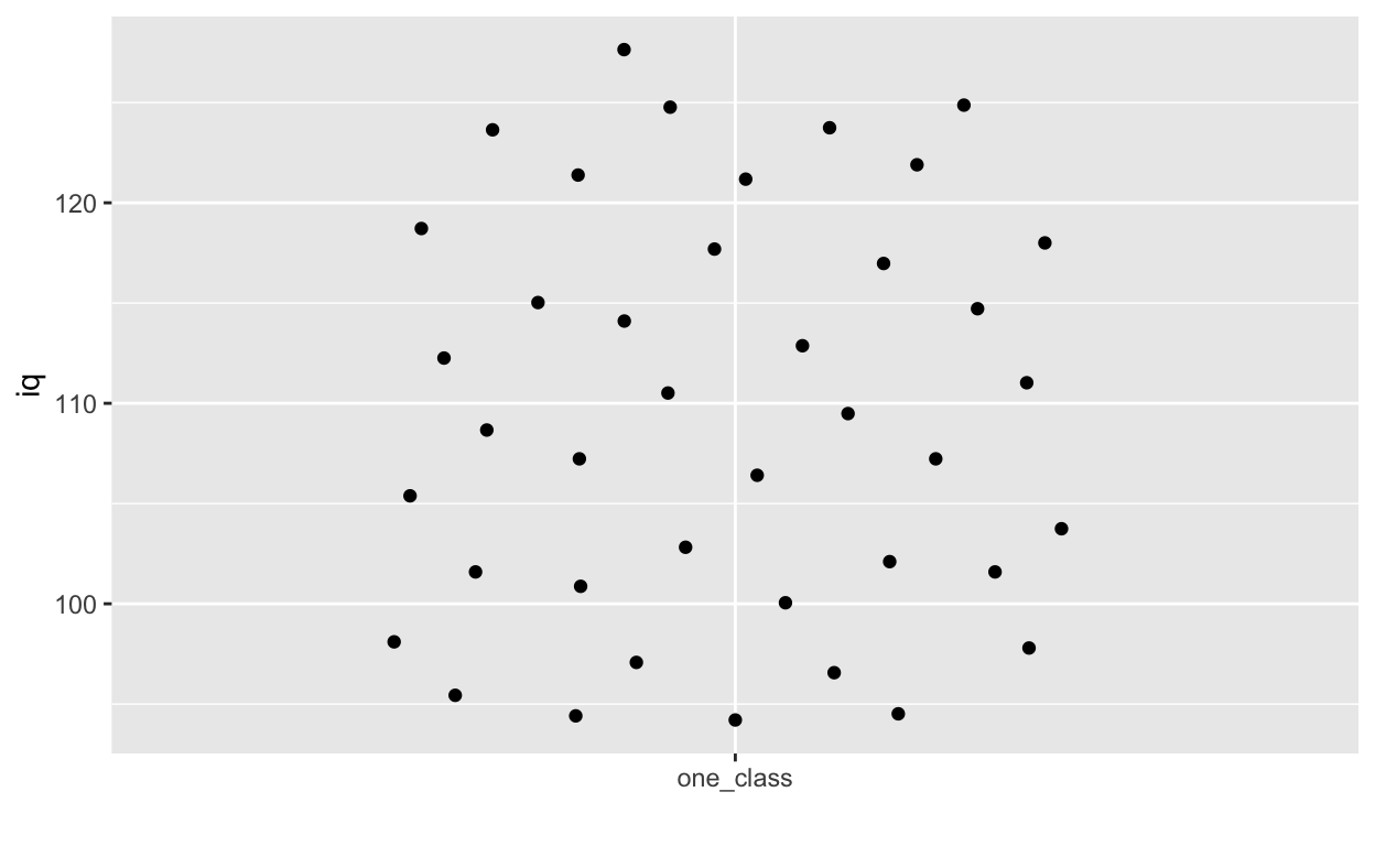
Summary statistics with ggplot2
stat_summary() can quickly help you compute summary statistics and plot them. If you get a warning message about Hmisc package, just install that package using install.packages('Hmisc') and then library(Hmisc)
ggplot(df1, aes(class, iq)) + # y: iq
    geom_quasirandom(alpha = 0.3) +
    stat_summary(fun = mean, geom = 'point', size = 3) + # apply mean function (fun = mean) (median or other functions work too)
    stat_summary(fun.data = mean_cl_normal, geom = 'errorbar', width = 0, size = 1) # apply mean_cl_normal function to data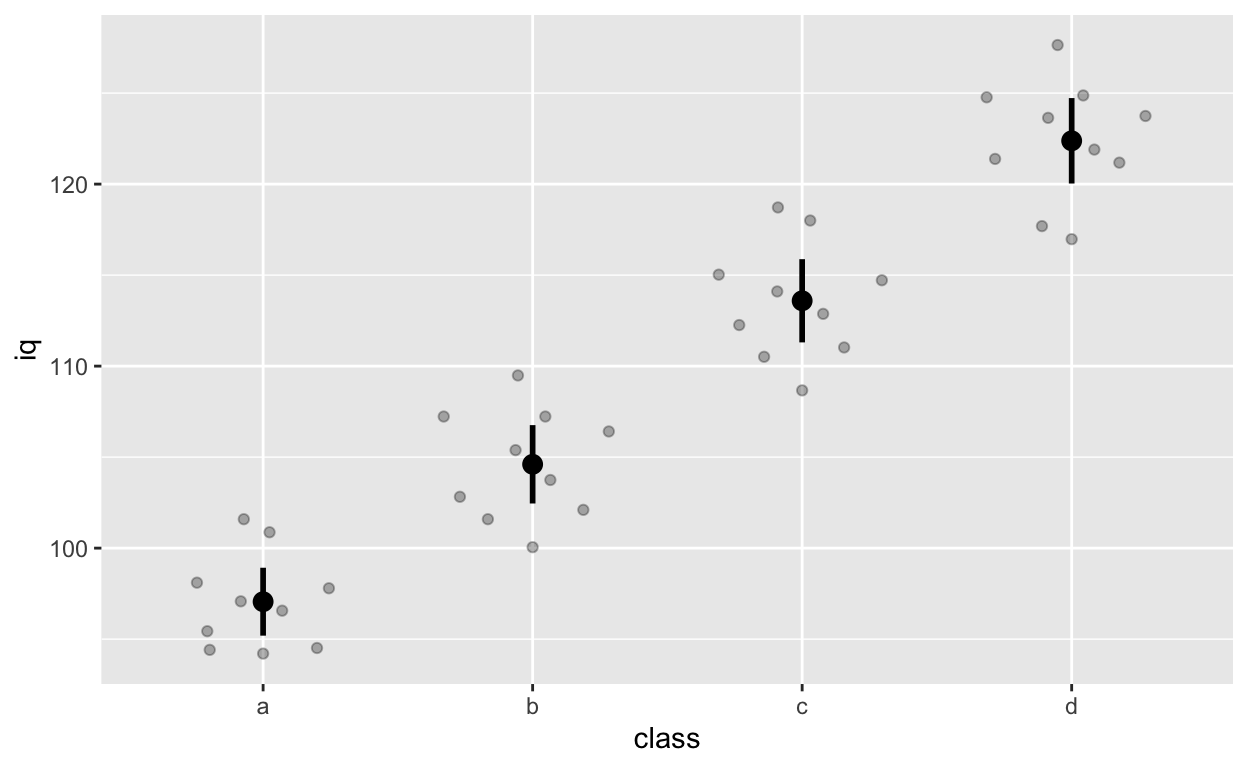
Facets for grouping: facet_wrap() and facet_grid()
Randomly assign gender to each row (see previous tutorial for detailed explanation of the code below)
df1$gender <- sample(x = c("female", "male"), size = 40, replace = T)Code from before
ggplot(df1, aes(iq, grades)) +
    geom_point(size = 3) + # change size and colour
    labs(y = "Exam grades (0 to 100)", x = "Intelligence (IQ)") + # rename axes
    scale_y_continuous(limits = c(0, 100), breaks = c(0, 20, 40, 60, 80, 100)) + # y axis limits/range (0, 100), break points
    scale_x_continuous(limits = c(90, 130)) + # x axis limits/range
    geom_smooth(method = 'lm', se = F)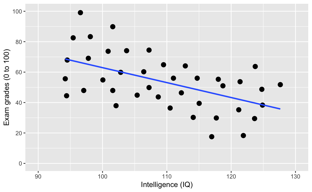
Using facets instead of col = class. See the last line of code facet_wrap().
facet_wrap(): one facet per class
ggplot(df1, aes(iq, grades)) +
    geom_point(size = 2) + # change size and colour
    labs(y = "Exam grades (0 to 100)", x = "Intelligence (IQ)") + # rename axes
    scale_y_continuous(limits = c(0, 100), breaks = c(0, 20, 40, 60, 80, 100)) + # y axis limits/range (0, 100), break points
    scale_x_continuous(limits = c(90, 130)) + # x axis limits/range
    geom_smooth(method = 'lm', se = F) +
    facet_wrap(~class) # one facet per class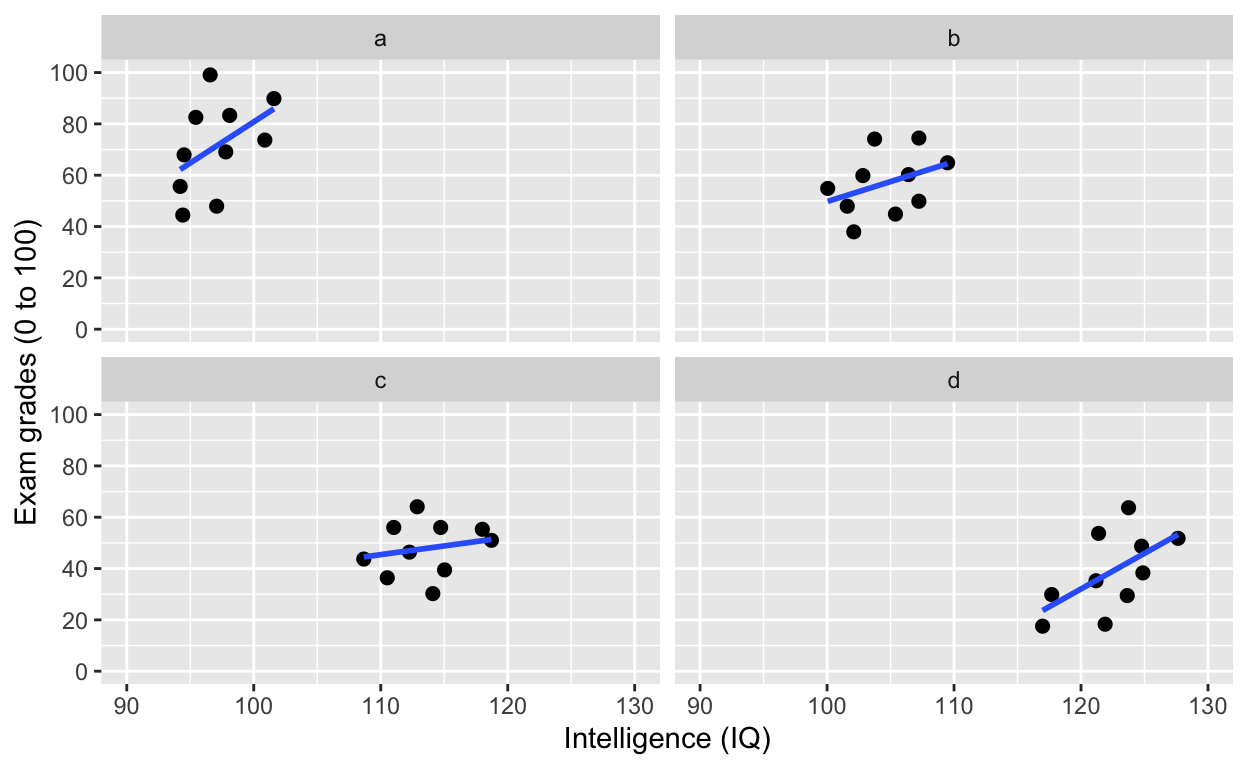
facet_wrap(): one facet per class and gender
ggplot(df1, aes(iq, grades)) +
    geom_point(size = 2) + # change size and colour
    labs(y = "Exam grades (0 to 100)", x = "Intelligence (IQ)") + # rename axes
    scale_y_continuous(limits = c(0, 100), breaks = c(0, 20, 40, 60, 80, 100)) + # y axis limits/range (0, 100), break points
    scale_x_continuous(limits = c(90, 130)) + # x axis limits/range
    geom_smooth(method = 'lm', se = F) +
    facet_wrap(class~gender) # one facet per class and gender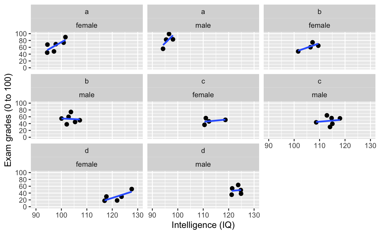
facet_grid(): one facet per gender
ggplot(df1, aes(iq, grades)) +
    geom_point(size = 2) + # change size and colour
    labs(y = "Exam grades (0 to 100)", x = "Intelligence (IQ)") + # rename axes
    scale_y_continuous(limits = c(0, 100), breaks = c(0, 20, 40, 60, 80, 100)) + # y axis limits/range (0, 100), break points
    scale_x_continuous(limits = c(90, 130)) + # x axis limits/range
    geom_smooth(method = 'lm', se = F) +
    facet_grid(.~gender) # one facet per gender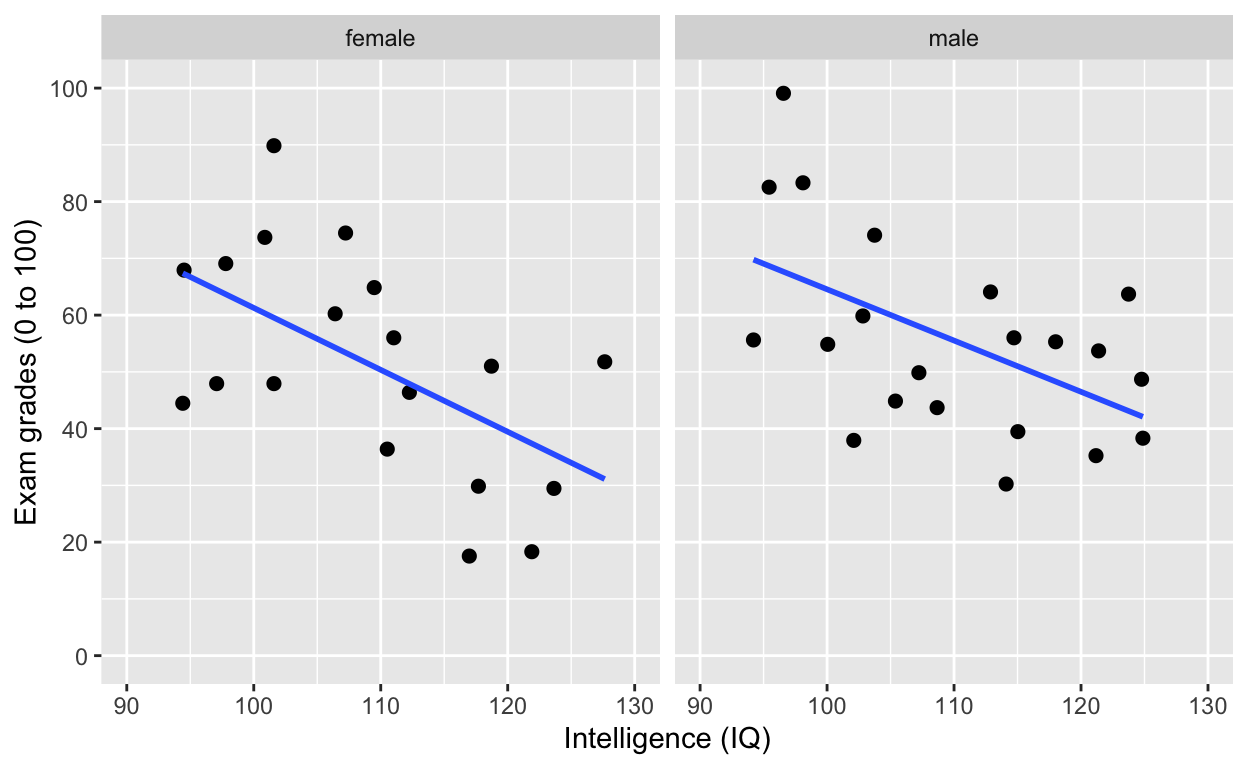
facet_grid(): one facet per gender
ggplot(df1, aes(iq, grades)) +
    geom_point(size = 2) + # change size and colour
    labs(y = "Exam grades (0 to 100)", x = "Intelligence (IQ)") + # rename axes
    scale_y_continuous(limits = c(0, 100), breaks = c(0, 20, 40, 60, 80, 100)) + # y axis limits/range (0, 100), break points
    scale_x_continuous(limits = c(90, 130)) + # x axis limits/range
    geom_smooth(method = 'lm', se = F) +
    facet_grid(gender~.) # one facet per gender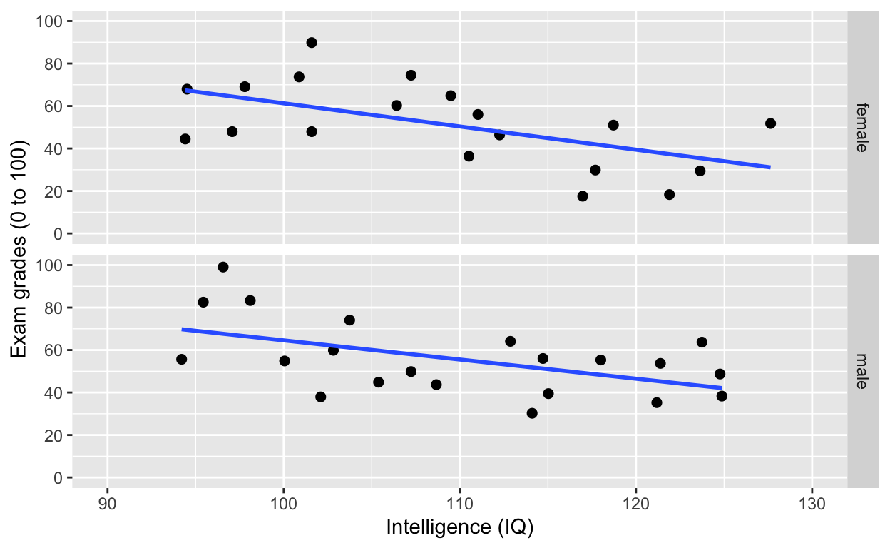
facet_grid(): one facet per class and gender
ggplot(df1, aes(iq, grades)) +
    geom_point(size = 2) + # change size and colour
    labs(y = "Exam grades (0 to 100)", x = "Intelligence (IQ)") + # rename axes
    scale_y_continuous(limits = c(0, 100), breaks = c(0, 20, 40, 60, 80, 100)) + # y axis limits/range (0, 100), break points
    scale_x_continuous(limits = c(90, 130)) + # x axis limits/range
    geom_smooth(method = 'lm', se = F) +
    facet_grid(gender~class) # one facet per gender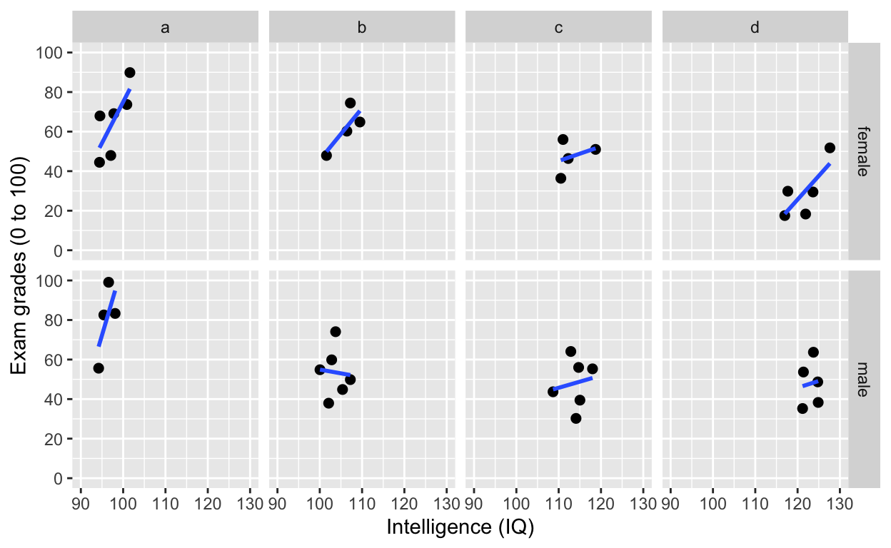
facet_grid(): one facet per class and gender
Add variable name
ggplot(df1, aes(iq, grades)) +
    geom_point(size = 2) + # change size and colour
    labs(y = "Exam grades (0 to 100)", x = "Intelligence (IQ)") + # rename axes
    scale_y_continuous(limits = c(0, 100), breaks = c(0, 20, 40, 60, 80, 100)) + # y axis limits/range (0, 100), break points
    scale_x_continuous(limits = c(90, 130)) + # x axis limits/range
    geom_smooth(method = 'lm', se = F) +
    facet_grid(gender~class, labeller = label_both) # one facet per gender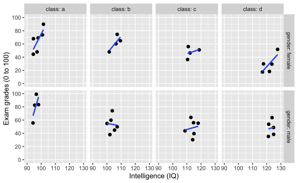
Fitting linear models (general linear model framework)
Fit a model to this this relationship
ggplot(df1, aes(iq, grades)) +
    geom_point() +
    labs(y = "Exam grades (0 to 100)", x = "Intelligence (IQ)") + # rename axes
    scale_y_continuous(limits = c(0, 100), breaks = c(0, 20, 40, 60, 80, 100)) + # y axis limits/range (0, 100), break points
    scale_x_continuous(limits = c(90, 130)) + # x axis limits/range
    geom_smooth(method = 'lm', se = F, col = 'black') # fit linear regression line, remove standard error, black line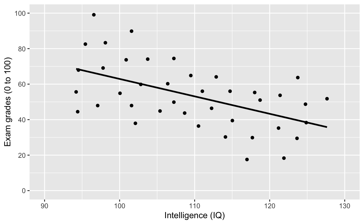
Model specification in R
- most model fitting functions prefer long-form data (aka tidy data)
- ~ is the symbol for “prediction” (read: “predicted by”)
- y ~ x: y predicted by x (y is outcome/dependent variable, x is predictor/independent variable)
lm(y ~ x, data)is the most commonly-used and flexible function (linear model)- covariates and predictors are specified in the same way (unlike SPSS)
Test the relationship in the plot above
model_linear <- lm(formula = iq ~ grades, data = df1)
summary(model_linear) # get model results and p values
Call:
lm(formula = iq ~ grades, data = df1)

Residuals:
     Min       1Q   Median       3Q      Max
-17.7002  -4.9650   0.3856   6.0826  17.6721

Coefficients:
             Estimate Std. Error t value Pr(>|t|)
(Intercept) 125.14212    4.23923  29.520  < 2e-16 ***
grades       -0.29306    0.07479  -3.919 0.000359 ***
---
Signif. codes:  0 '***' 0.001 '**' 0.01 '*' 0.05 '.' 0.1 ' ' 1

Residual standard error: 8.599 on 38 degrees of freedom
Multiple R-squared:  0.2878,    Adjusted R-squared:  0.2691
F-statistic: 15.36 on 1 and 38 DF,  p-value: 0.0003592
summaryh(model_linear) # generates APA-formmatted results (requires hausekeep package)
          term                                                  results
1: (Intercept) b = 125.14, SE = 4.24, t(38) = 29.52, p < .001, r = 0.98
2:      grades  b = −0.29, SE = 0.07, t(38) = −3.92, p < .001, r = 0.54
Note the significant negative relationship between iq and grades.
Since we know that class “moderates” the effect between iq and grades, let’s “control” for class by adding class into the model specification.
ggplot(df1, aes(iq, grades, col = class)) +
    geom_point(size = 3) + # change size and colour
    labs(y = "Exam grades (0 to 100)", x = "Intelligence (IQ)") + # rename axes
    scale_y_continuous(limits = c(0, 100), breaks = c(0, 20, 40, 60, 80, 100)) + # y axis limits/range (0, 100), break points
    scale_x_continuous(limits = c(90, 130)) + # x axis limits/range
    geom_smooth(method = 'lm', se = F) + # fit linear regression line
    geom_smooth(method = 'lm', se = F, aes(group = 1))
Test the relationship above by “controlling” for class
model_linear_class <- lm(iq ~ grades + class, data = df1)
summary(model_linear_class) # get model results and p values
Call:
lm(formula = iq ~ grades + class, data = df1)

Residuals:
    Min      1Q  Median      3Q     Max
-4.5552 -2.2276 -0.1403  2.0785  4.8499

Coefficients:
            Estimate Std. Error t value Pr(>|t|)
(Intercept) 90.74793    2.48240  36.557  < 2e-16 ***
grades       0.08841    0.03251   2.720   0.0101 *
classb       8.82731    1.33606   6.607 1.24e-07 ***
classc      18.61047    1.46538  12.700 1.15e-14 ***
classd      28.21349    1.64119  17.191  < 2e-16 ***
---
Signif. codes:  0 '***' 0.001 '**' 0.01 '*' 0.05 '.' 0.1 ' ' 1

Residual standard error: 2.796 on 35 degrees of freedom
Multiple R-squared:  0.9306,    Adjusted R-squared:  0.9227
F-statistic: 117.4 on 4 and 35 DF,  p-value: < 2.2e-16
summaryh(model_linear_class)
          term                                                 results
1: (Intercept) b = 90.75, SE = 2.48, t(35) = 36.56, p < .001, r = 0.99
2:      grades   b = 0.09, SE = 0.03, t(35) = 2.72, p = .010, r = 0.42
3:      classb   b = 8.83, SE = 1.34, t(35) = 6.61, p < .001, r = 0.74
4:      classc b = 18.61, SE = 1.47, t(35) = 12.70, p < .001, r = 0.91
5:      classd b = 28.21, SE = 1.64, t(35) = 17.19, p < .001, r = 0.95
Note the significantly positive relationship between iq and grades now.
Reference groups and releveling (changing reference group)
R automatically recodes categorical/factor variables into 0s and 1s (i.e., dummy-coding). Alphabets/letters/characters/numbers that come first (a comes before b) will be coded 0, and those that follow will be coded 1.
In our case, class “a” has been coded 0 (reference group) and all other classes (“b”, “c”, “d”) are contrasted against it, hence you have 3 other effects (“classb”, “classc”, “classd”) that reflect the difference between class “a” and each of the other classes.
To change reference group, use as.factor() and relevel()
To change reference groups, you first have to convert your grouping variable to factor class, which explicitly tells R your variable is a categorical/factor variable. Then use relevel() to change the reference group.
df1$class <- relevel(as.factor(df1$class), ref = "d")
levels(df1$class) # check reference levels (d is now the reference/first group)
[1] "d" "a" "b" "c"
summaryh(lm(iq ~ grades + class, data = df1)) # quickly fit model and look at outcome (no assignment to object)
          term                                                   results
1: (Intercept)  b = 118.96, SE = 1.54, t(35) = 77.41, p < .001, r = 1.00
2:      grades     b = 0.09, SE = 0.03, t(35) = 2.72, p = .010, r = 0.42
3:      classa b = −28.21, SE = 1.64, t(35) = −17.19, p < .001, r = 0.95
4:      classb b = −19.39, SE = 1.38, t(35) = −14.01, p < .001, r = 0.92
5:      classc   b = −9.60, SE = 1.29, t(35) = −7.47, p < .001, r = 0.78
Specify interactions
- y predicted by x1, x2, and their interactions: y ~ x1 + x2 + x1:x2
- concise expression: y ~ x1 * x2 (includes all main effects and interaction)
model_linear_interact <- lm(iq ~ grades + class + grades:class, data = df1)
summary(model_linear_interact)
Call:
lm(formula = iq ~ grades + class + grades:class, data = df1)

Residuals:
    Min      1Q  Median      3Q     Max
-4.6623 -2.3238 -0.2229  1.9845  4.9309

Coefficients:
               Estimate Std. Error t value Pr(>|t|)
(Intercept)   117.56287    2.57958  45.574  < 2e-16 ***
grades          0.12459    0.06237   1.998  0.05433 .
classa        -25.29661    4.70506  -5.376 6.64e-06 ***
classb        -18.39902    5.29099  -3.477  0.00148 **
classc         -6.97275    5.18349  -1.345  0.18802
grades:classa  -0.05745    0.08226  -0.698  0.48993
grades:classb  -0.02894    0.10111  -0.286  0.77653
grades:classc  -0.06191    0.11112  -0.557  0.58131
---
Signif. codes:  0 '***' 0.001 '**' 0.01 '*' 0.05 '.' 0.1 ' ' 1

Residual standard error: 2.898 on 32 degrees of freedom
Multiple R-squared:  0.9319,    Adjusted R-squared:  0.917
F-statistic: 62.52 on 7 and 32 DF,  p-value: < 2.2e-16
summaryh(model_linear_interact)
            term                                                  results
1:   (Intercept) b = 117.56, SE = 2.58, t(32) = 45.57, p < .001, r = 0.99
2:        grades    b = 0.12, SE = 0.06, t(32) = 2.00, p = .054, r = 0.33
3:        classa b = −25.30, SE = 4.71, t(32) = −5.38, p < .001, r = 0.69
4:        classb b = −18.40, SE = 5.29, t(32) = −3.48, p = .002, r = 0.52
5:        classc  b = −6.97, SE = 5.18, t(32) = −1.35, p = .188, r = 0.23
6: grades:classa  b = −0.06, SE = 0.08, t(32) = −0.70, p = .490, r = 0.12
7: grades:classb  b = −0.03, SE = 0.10, t(32) = −0.29, p = .776, r = 0.05
8: grades:classc  b = −0.06, SE = 0.11, t(32) = −0.56, p = .581, r = 0.10
Intercept-only model
R uses 1 to refer to the intercept
model_linear_intercept <- lm(iq ~ 1, data = df1) # mean iq
coef(model_linear_intercept) # get coefficients from model
(Intercept)
   109.4077
# summaryh(model_linear_intercept)
df1[, mean(iq)] # matches the intercept term
[1] 109.4077
mean(df1$iq) # same as above
[1] 109.4077Remove intercept from model (if you ever need to do so…) by specifying -1. Another way is to specify 0 in the syntax.
model_linear_noIntercept <- lm(iq ~ grades - 1, data = df1) # substract intercept
summary(model_linear_noIntercept)
Call:
lm(formula = iq ~ grades - 1, data = df1)

Residuals:
    Min      1Q  Median      3Q     Max
-81.586  -6.131  14.935  35.214  88.969

Coefficients:
       Estimate Std. Error t value Pr(>|t|)
grades   1.7980     0.1158   15.52   <2e-16 ***
---
Signif. codes:  0 '***' 0.001 '**' 0.01 '*' 0.05 '.' 0.1 ' ' 1

Residual standard error: 41.52 on 39 degrees of freedom
Multiple R-squared:  0.8607,    Adjusted R-squared:  0.8571
F-statistic:   241 on 1 and 39 DF,  p-value: < 2.2e-16
# summaryh(model_linear_noIntercept)

coef(lm(iq ~ 0 + grades, data = df1)) # no intercept
  grades
1.797984
Be careful when you remove the intercept (or set it to 0). See my article to learn more.
Fitting ANOVA with anova and aov
By default, R uses Type I sum of squares.
Let’s test this model with ANOVA.
ggplot(df1, aes(class, iq)) + # y: iq
    geom_quasirandom(alpha = 0.3) +
    stat_summary(fun = mean, geom = 'point', size = 3) + # apply mean function
    stat_summary(fun.data = mean_cl_normal, geom = 'errorbar', width = 0, size = 1) # apply mean_cl_normal function to data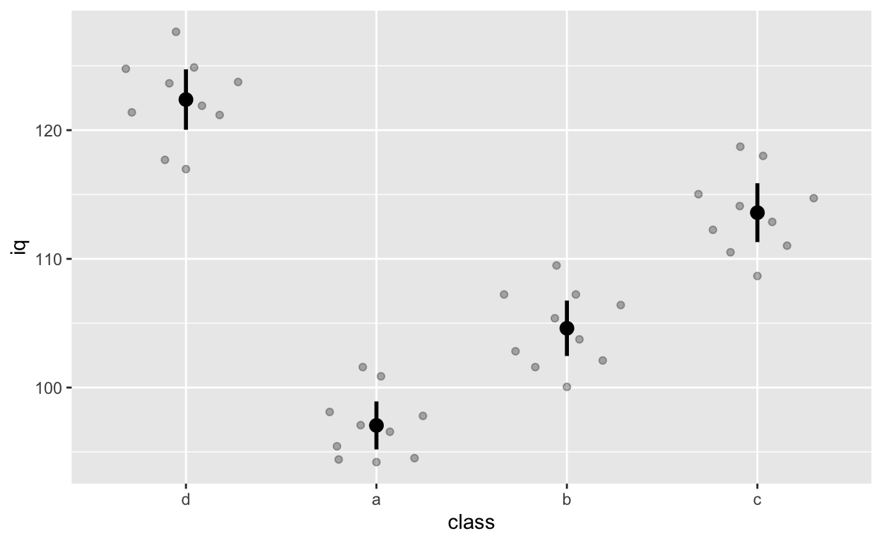
Note that class d comes first because we releveled it earlier on (we changed the reference group to d).
Fit ANOVA with aov()
anova_class <- aov(grades ~ class, data = df1)
summary(anova_class)
            Df Sum Sq Mean Sq F value   Pr(>F)
class        3   5821  1940.4    9.44 9.73e-05 ***
Residuals   36   7400   205.6
---
Signif. codes:  0 '***' 0.001 '**' 0.01 '*' 0.05 '.' 0.1 ' ' 1
Class * gender interaction (and main effects)
ggplot(df1, aes(class, iq, col = gender)) + # y: iq
    geom_quasirandom(alpha = 0.3, dodge = 0.5) +
    stat_summary(fun = mean, geom = 'point', size = 3, position = position_dodge(0.5)) +
    stat_summary(fun.data = mean_cl_normal, geom = 'errorbar',
                 width = 0, size = 1, position = position_dodge(0.5))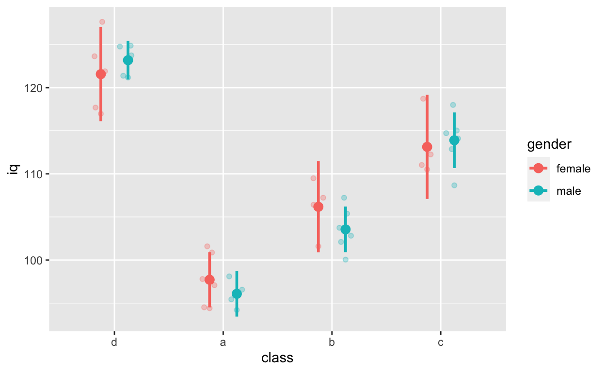
anova_classGender <- aov(grades ~ class * gender, data = df1)
anova_classGender
Call:
   aov(formula = grades ~ class * gender, data = df1)

Terms:
                   class   gender class:gender Residuals
Sum of Squares  5821.086  412.005     1128.603  5859.355
Deg. of Freedom        3        1            3        32

Residual standard error: 13.53162
Estimated effects may be unbalanced
Specify contrasts resources
Post-hoc tests resources
Plotting and testing simple effects when you have interactions
interactionspackage: see here for more infosjPlotpackage: see here- more tutorial and packages
Fit t-test with t.test()
Fit models for this figure
ggplot(df1, aes(class, iq, col = gender)) + # y: iq
    geom_quasirandom(alpha = 0.3, dodge = 0.5) +
    stat_summary(fun = mean, geom = 'point', size = 3, position = position_dodge(0.5)) +
    stat_summary(fun.data = mean_cl_normal, geom = 'errorbar',
                 width = 0, size = 1, position = position_dodge(0.5))
Gender effect
ttest_gender <- t.test(iq ~ gender, data = df1)
ttest_gender
    Welch Two Sample t-test

data:  iq by gender
t = -0.23058, df = 37.645, p-value = 0.8189
alternative hypothesis: true difference in means is not equal to 0
95 percent confidence interval:
 -7.269840  5.783542
sample estimates:
mean in group female   mean in group male
            109.0175             109.7607
summaryh(ttest_gender)
                             results
1: t(38) = −0.23, p = .819, r = 0.04
class a vs. class d
ttest_classAD <- t.test(iq ~ class, data = df1[class %in% c("a", "d")]) # data.table subsetting
ttest_classAD
    Welch Two Sample t-test

data:  iq by class
t = 19.105, df = 17.128, p-value = 5.488e-13
alternative hypothesis: true difference in means is not equal to 0
95 percent confidence interval:
 22.52811 28.11803
sample estimates:
mean in group d mean in group a
      122.37948        97.05641
summaryh(ttest_classAD, showTable = T) # show all other effect sizes
$results
                             results
1: t(17) = 19.10, p < .001, r = 0.98

$results2
          term     df statistic p.value  es.r  es.d
1: iq by class 17.128    19.105       0 0.977 9.233
Linear mixed effects (aka. multi-level or hierarchical) models with lmer() from the lme4 package
Rather than “control” for class when fitting models to test the relationship between iq and grades below, we can use multi-level models to specify nesting within the data. See here for beautiful visual introduction to multi-level models.
Another function is nlme() from the lme package. We use both nlme() and lmer(), depending on our needs.
ggplot(df1, aes(iq, grades, col = class)) +
    geom_point(size = 3) + # change size and colour
    labs(y = "Exam grades (0 to 100)", x = "Intelligence (IQ)") + # rename axes
    scale_y_continuous(limits = c(0, 100), breaks = c(0, 20, 40, 60, 80, 100)) + # y axis limits/range (0, 100), break points
    scale_x_continuous(limits = c(90, 130)) + # x axis limits/range
    geom_smooth(method = 'lm', se = F) + # fit linear regression line
    geom_smooth(method = 'lm', se = F, aes(group = 1))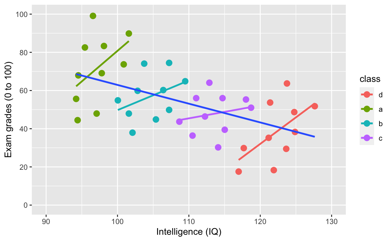
Model specification with lmer()
- y ~ x (same as other models)
- (1 | group): varying intercept (one intercept per group)
- (1 + x | group): varying intercept and slope (one intercept and slope per group)
- (1 + x || group): varying intercept and slope but no correlation between them
Random intercept model (fixed slope)
m_intercept <- lmer(grades ~ iq + (1 | class), data = df1)
summary(m_intercept)
Linear mixed model fit by REML. t-tests use Satterthwaite's method [
lmerModLmerTest]
Formula: grades ~ iq + (1 | class)
   Data: df1

REML criterion at convergence: 326

Scaled residuals:
     Min       1Q   Median       3Q      Max
-1.71341 -0.79563  0.03887  0.56708  2.18978

Random effects:
 Groups   Name        Variance Std.Dev.
 class    (Intercept) 895.5    29.92
 Residual             176.7    13.29
Number of obs: 40, groups:  class, 4

Fixed effects:
             Estimate Std. Error        df t value Pr(>|t|)
(Intercept) -100.7338    74.1311   27.4649  -1.359   0.1852
iq             1.4115     0.6633   31.3429   2.128   0.0413 *
---
Signif. codes:  0 '***' 0.001 '**' 0.01 '*' 0.05 '.' 0.1 ' ' 1

Correlation of Fixed Effects:
   (Intr)
iq -0.979
summaryh(m_intercept)
          term                                                    results
1: (Intercept) b = −100.73, SE = 74.13, t(27) = −1.36, p = .185, r = 0.25
2:          iq      b = 1.41, SE = 0.66, t(31) = 2.13, p = .041, r = 0.36
coef(m_intercept) # check coefficients for each class
$class
  (Intercept)       iq
d  -133.42844 1.411459
a   -66.31752 1.411459
b   -90.94789 1.411459
c  -112.24144 1.411459

attr(,"class")
[1] "coef.mer"
By accounting for nesting within class, the relationship between iq and grades is positive!
Random intercept and slope model
m_interceptSlope <- lmer(grades ~ iq + (1 + iq | class), data = df1)
summary(m_interceptSlope)
Linear mixed model fit by REML. t-tests use Satterthwaite's method [
lmerModLmerTest]
Formula: grades ~ iq + (1 + iq | class)
   Data: df1

REML criterion at convergence: 326

Scaled residuals:
     Min       1Q   Median       3Q      Max
-1.71457 -0.77510  0.03527  0.57023  2.20255

Random effects:
 Groups   Name        Variance  Std.Dev. Corr
 class    (Intercept)  51.87048  7.2021
          iq            0.04487  0.2118  1.00
 Residual             176.37727 13.2807
Number of obs: 40, groups:  class, 4

Fixed effects:
             Estimate Std. Error        df t value Pr(>|t|)
(Intercept) -102.2620    72.9396   30.3464  -1.402   0.1711
iq             1.4407     0.6777   11.9275   2.126   0.0551 .
---
Signif. codes:  0 '***' 0.001 '**' 0.01 '*' 0.05 '.' 0.1 ' ' 1

Correlation of Fixed Effects:
   (Intr)
iq -0.978
convergence code: 0
boundary (singular) fit: see ?isSingular
summaryh(m_interceptSlope)
          term                                                    results
1: (Intercept) b = −102.26, SE = 72.94, t(30) = −1.40, p = .171, r = 0.25
2:          iq      b = 1.44, SE = 0.68, t(12) = 2.13, p = .055, r = 0.52
coef(m_interceptSlope) # check coefficients for each class
$class
  (Intercept)       iq
d   -109.8130 1.218571
a    -93.6742 1.693239
b   -100.2293 1.500443
c   -105.3316 1.350377

attr(,"class")
[1] "coef.mer"
Random intercept and slope model (no correlations between varying slopes and intercepts)
m_interceptSlope_noCor <- lmer(grades ~ iq + (1 + iq || class), data = df1)
summary(m_interceptSlope_noCor)
Linear mixed model fit by REML. t-tests use Satterthwaite's method [
lmerModLmerTest]
Formula: grades ~ iq + (1 + iq || class)
   Data: df1

REML criterion at convergence: 326

Scaled residuals:
     Min       1Q   Median       3Q      Max
-1.71319 -0.79539  0.03875  0.56712  2.18967

Random effects:
 Groups   Name        Variance  Std.Dev.
 class    (Intercept) 8.937e+02 29.895487
 class.1  iq          1.279e-06  0.001131
 Residual             1.767e+02 13.292074
Number of obs: 40, groups:  class, 4

Fixed effects:
             Estimate Std. Error        df t value Pr(>|t|)
(Intercept) -100.6290    74.1208   27.4574  -1.358   0.1856
iq             1.4105     0.6633   31.3229   2.127   0.0414 *
---
Signif. codes:  0 '***' 0.001 '**' 0.01 '*' 0.05 '.' 0.1 ' ' 1

Correlation of Fixed Effects:
   (Intr)
iq -0.979
convergence code: 0
boundary (singular) fit: see ?isSingular
summaryh(m_interceptSlope_noCor)
          term                                                    results
1: (Intercept) b = −100.63, SE = 74.12, t(27) = −1.36, p = .186, r = 0.25
2:          iq      b = 1.41, SE = 0.66, t(31) = 2.13, p = .041, r = 0.36
coef(m_interceptSlope_noCor) # check coefficients for each class
$class
  (Intercept)       iq
d   -133.3096 1.410497
a    -66.2263 1.410507
b    -90.8482 1.410503
c   -112.1320 1.410499

attr(,"class")
[1] "coef.mer"
Random slope model (fixed intercept)
m_slope <- lmer(grades ~ iq + (0 + iq | class), data = df1)
summary(m_slope)
Linear mixed model fit by REML. t-tests use Satterthwaite's method [
lmerModLmerTest]
Formula: grades ~ iq + (0 + iq | class)
   Data: df1

REML criterion at convergence: 326

Scaled residuals:
     Min       1Q   Median       3Q      Max
-1.71468 -0.75940  0.02992  0.57630  2.20673

Random effects:
 Groups   Name Variance  Std.Dev.
 class    iq     0.07826  0.2797
 Residual      176.30897 13.2781
Number of obs: 40, groups:  class, 4

Fixed effects:
             Estimate Std. Error        df t value Pr(>|t|)
(Intercept) -102.5810    72.8999   31.8200  -1.407   0.1691
iq             1.4484     0.6854   27.8157   2.113   0.0437 *
---
Signif. codes:  0 '***' 0.001 '**' 0.01 '*' 0.05 '.' 0.1 ' ' 1

Correlation of Fixed Effects:
   (Intr)
iq -0.979
summaryh(m_slope)
          term                                                    results
1: (Intercept) b = −102.58, SE = 72.90, t(32) = −1.41, p = .169, r = 0.24
2:          iq      b = 1.45, SE = 0.69, t(28) = 2.11, p = .044, r = 0.37
coef(m_slope) # check coefficients for each class
$class
  (Intercept)       iq
d    -102.581 1.159517
a    -102.581 1.784959
b    -102.581 1.523003
c    -102.581 1.326087

attr(,"class")
[1] "coef.mer"
More multi-level model resources
MANOVA
Let’s use a different dataset. iris, a famous dataset that comes with R. Type ?iris in your console for more information about this dataset.
irisDT <- as.data.table(iris) # convert to data.table and tibble
irisDT # wide form data
     Sepal.Length Sepal.Width Petal.Length Petal.Width   Species
  1:          5.1         3.5          1.4         0.2    setosa
  2:          4.9         3.0          1.4         0.2    setosa
  3:          4.7         3.2          1.3         0.2    setosa
  4:          4.6         3.1          1.5         0.2    setosa
  5:          5.0         3.6          1.4         0.2    setosa
 ---
146:          6.7         3.0          5.2         2.3 virginica
147:          6.3         2.5          5.0         1.9 virginica
148:          6.5         3.0          5.2         2.0 virginica
149:          6.2         3.4          5.4         2.3 virginica
150:          5.9         3.0          5.1         1.8 virginica
The dataset is in wide form. To visualize easily with ggplot, we need to convert it to long form (more on converting between forms) in future tutorials.
gather(irisDT, meaureLength, length, -Species) %>% # convert from wide to long form
    ggplot(aes(Species, length, col = meaureLength)) + # no need to specify data because of piping
geom_quasirandom(alpha = 0.3, dodge = 0.5) 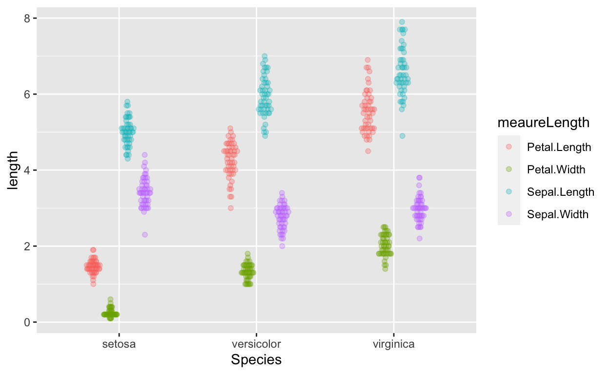
MANOVA to test if species predicts length of sepal length and petal length?
outcome <- cbind(irisDT$Sepal.Length, irisDT$Petal.Length) # cbind (column bind)
manova_results <- manova(outcome ~ Species, data = iris)
summary(manova_results) # manova results
           Df Pillai approx F num Df den Df    Pr(>F)
Species     2 0.9885   71.829      4    294 < 2.2e-16 ***
Residuals 147
---
Signif. codes:  0 '***' 0.001 '**' 0.01 '*' 0.05 '.' 0.1 ' ' 1
summary.aov(manova_results) # see which outcome variables differ
 Response 1 :
             Df Sum Sq Mean Sq F value    Pr(>F)
Species       2 63.212  31.606  119.26 < 2.2e-16 ***
Residuals   147 38.956   0.265
---
Signif. codes:  0 '***' 0.001 '**' 0.01 '*' 0.05 '.' 0.1 ' ' 1

 Response 2 :
             Df Sum Sq Mean Sq F value    Pr(>F)
Species       2 437.10 218.551  1180.2 < 2.2e-16 ***
Residuals   147  27.22   0.185
---
Signif. codes:  0 '***' 0.001 '**' 0.01 '*' 0.05 '.' 0.1 ' ' 1
MANOVA resources
Computing between- and within-subjects error bars (also between-within designs)
Error bars for between- and within-subjects designs have to be calculated differently. There’s much debate on how to compute within-subjects this properly…
cw <- as.data.table(ChickWeight) # convert built-in ChickWeight data to data.table and tibbledata information
- ID variable: Chick (50 chicks)
- outcome/dependent variable: weight (weight of Chick) (within-subjects variable)
- predictor/indepedent variable: Diet (diet each Chick was assigned to) (between-subjects variable)
cw # weight of 50 chicks are different times, on different diets
     weight Time Chick Diet
  1:     42    0     1    1
  2:     51    2     1    1
  3:     59    4     1    1
  4:     64    6     1    1
  5:     76    8     1    1
 ---
574:    175   14    50    4
575:    205   16    50    4
576:    234   18    50    4
577:    264   20    50    4
578:    264   21    50    4
cw[, unique(Time)] # time points
[1] 0 2 4 6 8 10 12 14 16 18 20 21
cw[, n_distinct(Chick)] # no. of Chicks
[1] 50
cw[, unique(Diet)] # Diets
[1] 1 2 3 4
Levels: 1 2 3 4
Between-subject error bars
Do different diets lead to different weights? Each chick is only assigned to one diet (rather than > 1 diet), so we can use between-subjects error bars (or confidence intervals).
ggplot(cw, aes(Diet, weight)) +
    geom_quasirandom(alpha = 0.3) + # this line plots raw data and can be omitted, depending on your plotting preferences
    stat_summary(fun = mean, geom = 'point', size = 5) + # compute mean and plot
    stat_summary(fun.data = mean_cl_normal, geom = 'errorbar', width = 0, size = 1) # compute between-sub confidence intervals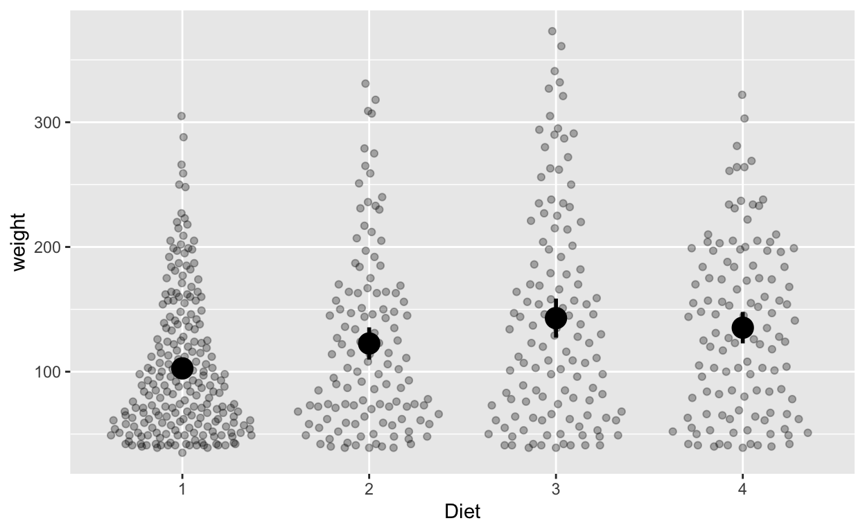
Within-subject error bars
How does weight change over time (ignoring diet)? Each chick has multiple measurements of time, so we’ll use within-subjects error bars, which we have to calculate ourselves. Use seWithin() from the hausekeep package to compute within-subjects error bars.
cw_weight_withinEB <- seWithin(data = cw, measurevar = c("weight"),
                               withinvars = c("Time"), idvar = "Chick")
The output contains the mean weight at each time, number of values (N), standard deviation, standard error, and confidence interval (default 95% unless you change via the conf.interval argument). The output contains information you’ll use for plotting with ggplot.
Plot with within-subjects error bars
ggplot(cw_weight_withinEB, aes(Time, weight)) +
    geom_quasirandom(data = cw, alpha = 0.1) + # this line plots raw data and can be omitted, depending on your plotting
    geom_point() + # add points
    geom_errorbar(aes(ymin = weight - ci, ymax = weight + ci), width = 0) # ymin (lower bound), ymax (upper bound)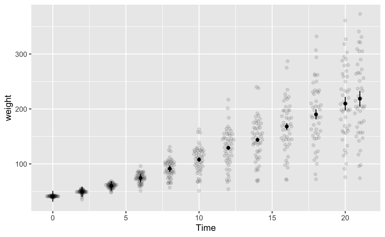
Note the second line geom_quasirandom(data = cw, alpha = 0.1) adds the raw data to the plot (hence data = cw). Depending your data structure and research questions, you might have to compute your “raw data” for the plot differently before specifying it in geom_quasirandom().
Plot with between-subjects error bars (WRONG but illustrative purposes)
ggplot(cw, aes(Time, weight)) +
    geom_quasirandom(alpha = 0.1) + # this line plots raw data and can be omitted, depending on your plotting preferences
    stat_summary(fun = mean, geom = 'point') + # compute mean and plot
    stat_summary(fun.data = mean_cl_normal, geom = 'errorbar', width = 0) # compute between-sub confidence intervals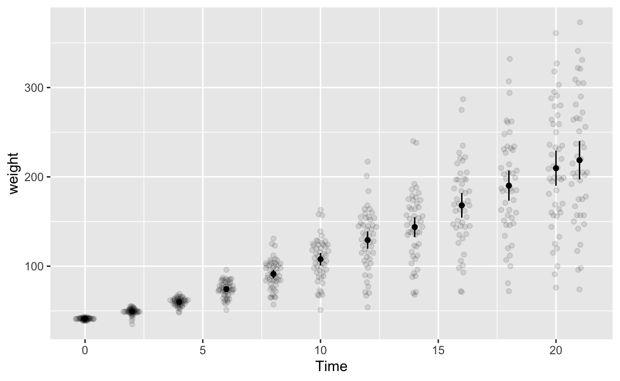
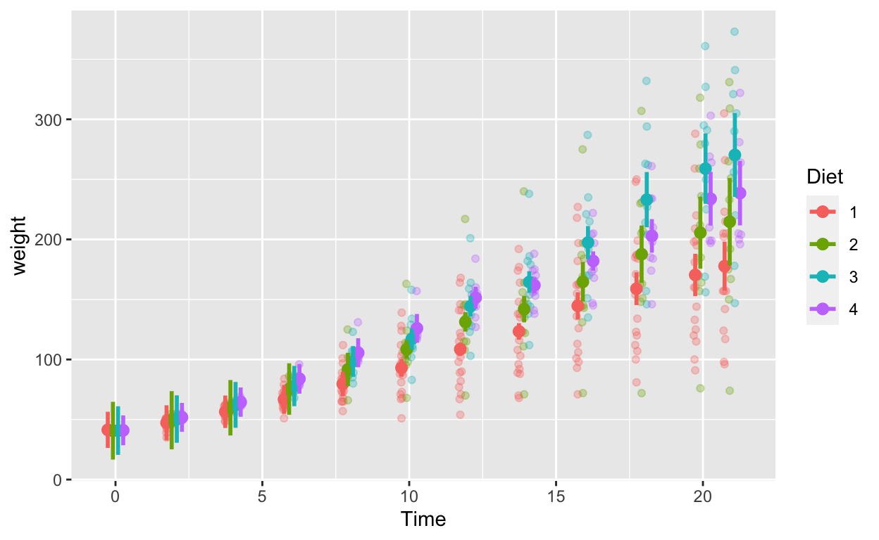
Mixed (between-within) designs
Let’s investigate the effects of time (within-subjects) and diet (between-subjects) together.
cw_weight_mixed <- seWithin(data = cw, measurevar = c("weight"),
                            betweenvars = c("Diet"), withinvars = c("Time"),
idvar = "Chick")Now your summary output has the Diet column.
ggplot(cw_weight_mixed, aes(Time, weight, col = as.factor(Diet))) + # Diet is numeric but we want it to be a factor/categorical variable
    geom_quasirandom(data = cw, alpha = 0.3, dodge = 0.7) + # this line plots raw data and can be omitted, depending on your plotting
    geom_point(position = position_dodge(0.7), size = 2.5) + # add points
    geom_errorbar(aes(ymin = weight - ci, ymax = weight + ci), width = 0, position = position_dodge(0.7), size = 1) + # ymin (lower bound), ymax (upper bound)
    labs(col = "Diet")