Table of Contents
Get source code for this RMarkdown script here.
Consider being a patron and supporting my work?
Donate and become a patron: If you find value in what I do and have learned something from my site, please consider becoming a patron. It takes me many hours to research, learn, and put together tutorials. Your support really matters.
Dynamite or bar plots must die?
A recent open letter to journal editors said that “dynamite plots must die”.
Statisticians have been pointing out the problem with dynamite plots1, also known as bar and line graphs, for years. Karl Broman lists them as one of the top ten worst graphs2. The problem has even been documented in the peer reviewed literature.
One of my professional pet peeves is dynamite plots. Sometimes they are incorrectly referred to as bar plots. Dynamite plots do not have a formal name because they are not a part of conventional statistical graphics that should be used in reporting scientific results. But they are everywhere! ~ Tatsuki Koyama (Vanderbilt Biostatistics)
Graphics reveal data, communicate complex ideas and dependencies with clarity, precision and efficiency. ~ Edward Tufte
Many others have also suggested we need to plot better (Drummond and Vowler 2011; Weissgerber et al. 2015). Here, I’m simulating datasets to compare barplots (dynamite plots), boxplots, violin plots, and another kind of plot I prefer (ggbeeswarm).
# load packages
library(data.table); library(tidyverse); library(gganimate);
library(ggbeeswarm); library(rmarkdown); library(knitr)
theme_set(theme_bw())  # set overall ggplot theme
Randomly generate 10 datasets with same mean and sd
Within each dataset, we have data from two groups, with 50 data points (e.g., subjects) per group. One group has mean 100 (sd = 15) and the other has mean 105 (sd = 45).
# extend R's rnorm() function
# rnormFixed generates random data from a normal distribution
# but ensures mean and sd values are exactly what we wanted
rnormFixed <- function(n, mean, sd) {
    mean + sd * scale(rnorm(n))
}

set.seed(1) # to ensure results/figures can be replicated
n <- 50 # datapoints per group
datasets <- 10

# generate datasets
dt1 <- lapply(1:datasets, # loop iterator
              function(x) {data.table(
                scores = c(rnormFixed(n = n, mean = 100, sd = 15), # mean of group 1
                           rnormFixed(n = n, mean = 105, sd = 45)), # mean of group 2
                group = rep(x = c("group 1", "group 2"), each = n), # condition label
                dataset = x)})
dt1 <- bind_rows(dt1) # bind list containing separate datasets into a dataframe
dt1
         scores   group dataset
   1:  86.88524 group 1       1
   2: 101.50100 group 1       1
   3:  83.11131 group 1       1
   4: 126.96975 group 1       1
   5: 104.13269 group 1       1
  ---
 996:  96.99936 group 2      10
 997:  73.10838 group 2      10
 998:  92.53620 group 2      10
 999:  47.75614 group 2      10
1000:  80.82894 group 2      10
Compute mean and standard deviation for each dataset and group.
dt1[, .(scores = mean(scores), scores_stdev = sd(scores)), by = .(dataset, group)]
    dataset   group scores scores_stdev
 1:       1 group 1    100           15
 2:       1 group 2    105           45
 3:       2 group 1    100           15
 4:       2 group 2    105           45
 5:       3 group 1    100           15
 6:       3 group 2    105           45
 7:       4 group 1    100           15
 8:       4 group 2    105           45
 9:       5 group 1    100           15
10:       5 group 2    105           45
11:       6 group 1    100           15
12:       6 group 2    105           45
13:       7 group 1    100           15
14:       7 group 2    105           45
15:       8 group 1    100           15
16:       8 group 2    105           45
17:       9 group 1    100           15
18:       9 group 2    105           45
19:      10 group 1    100           15
20:      10 group 2    105           45
R code to generate four figures below
Compare barplot, boxplot, violin plot, and plot with geom_quasirandom() from ggbeeswarm package.
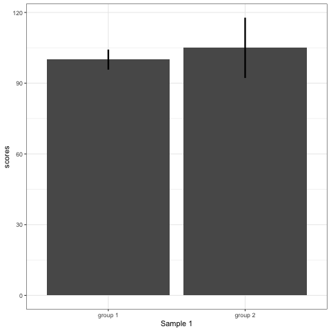
# barplot
plot_bar <- ggplot(dt1, aes(group, scores)) +
    stat_summary(fun.y = mean, geom = 'bar', size = 6) +
    stat_summary(fun.data = mean_cl_normal, geom = 'errorbar', width = 0, size = 1.1) +
    transition_states(dataset) +
    labs(x = 'Sample {closest_state}')
plot_bar
# anim_save("./attachments/plot_bar.gif", plot_bar)
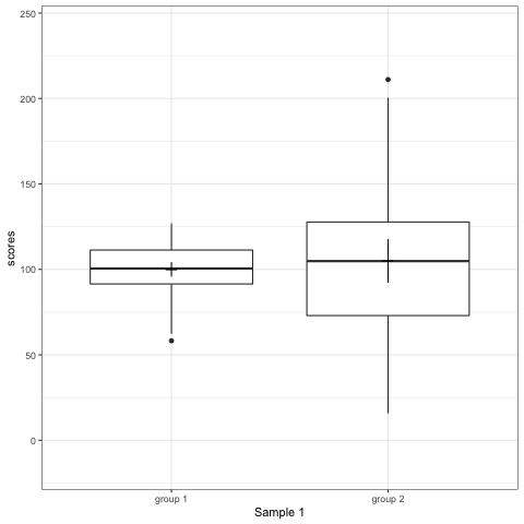
plot_boxplot <- ggplot(dt1, aes(group, scores)) +
    geom_boxplot() +
    stat_summary(fun.y = mean, geom = 'point', shape = 95, size = 6) +
    stat_summary(fun.data = mean_cl_normal, geom = 'errorbar', width = 0) +
    transition_states(dataset) +
    labs(x = 'Sample {closest_state}')
plot_boxplot
# anim_save("./attachments/plot_boxplot.gif", plot_boxplot)
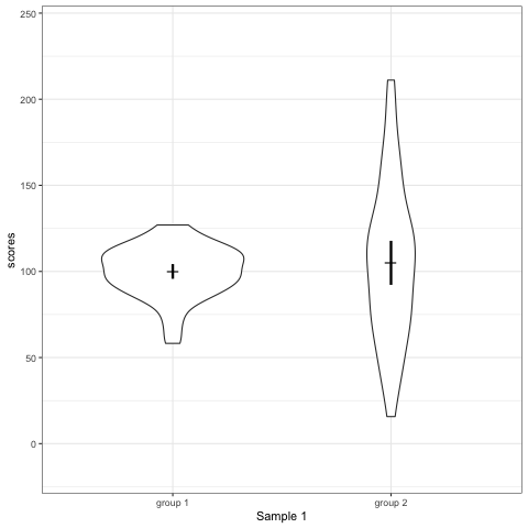
plot_violin <- ggplot(dt1, aes(group, scores)) +
    geom_violin() +
    stat_summary(fun.y = mean, geom = 'point', shape = 95, size = 6) +
    stat_summary(fun.data = mean_cl_normal, geom = 'errorbar', width = 0, size = 1.1) +
    scale_colour_viridis_d(begin = 0, end = 0.5) +
    transition_states(dataset) +
    labs(x = 'Sample {closest_state}')
plot_violin
# anim_save("./attachments/plot_violin.gif", plot_violin)
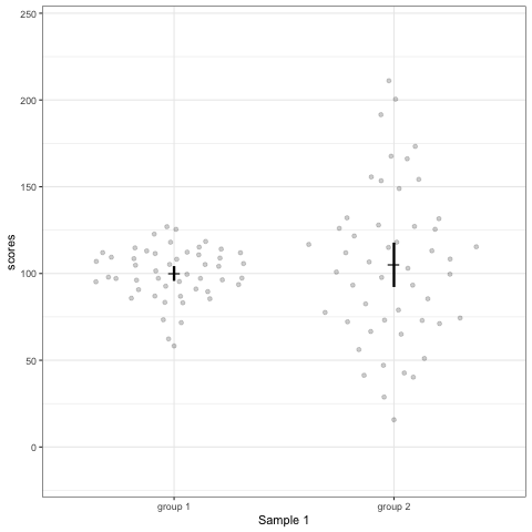
plot_dotdist <- ggplot(dt1, aes(group, scores)) +
    geom_quasirandom(alpha = 0.2) +
    stat_summary(fun.y = mean, geom = 'point', shape = 95, size = 6) +
    stat_summary(fun.data = mean_cl_normal, geom = 'errorbar', width = 0, size = 1.1) +
    scale_colour_viridis_d(begin = 0, end = 0.5) +
    transition_states(dataset) +
    labs(x = 'Sample {closest_state}')
plot_dotdist
# anim_save("./attachments/plot_dotdist.gif", plot_dotdist)
Comparing bar plots, boxplots, violin plots, and geom_quasirandom() plots
Note what happens in the four figures below.
- Barplots hide data. Means and standard deviation don’t change across the 10 datasets.
- Boxplot are slightly more informative and shows the outliers.
- Violin plots are also informative. They show the distributions.
geom_quasirandomfrom ggbeeswarm package plots the distribution and dots. Such plots are most informative.
Support my work
Support my work and become a patron here!
Drummond, GB, and SL Vowler. 2011. “Show the Data, Don’t Conceal Them.” Adv Physiol Educ 35 (2). Department of Anaesthesia; Pain Medicine, University of Edinburgh, UK. g.b.drummond@ed.ac.uk: 130–32. https://www.physiology.org/doi/pdf/10.1152/advan.00009.2011.
Weissgerber, TL, NM Milic, SJ Winham, and VD Garovic. 2015. “Beyond Bar and Line Graphs: Time for a New Data Presentation Paradigm.” PLoS Biol. 13 (4). Division of Nephrology & Hypertension, Mayo Clinic, Rochester, Minnesota, United States of America. Division of Nephrology & Hypertension, Mayo Clinic, Rochester, Minnesota, United States of America; Department of Biostatistics, Medical Faculty, University of Belgrade, Belgrade, Serbia. Division of Biomedical Statistic; Informatics, Mayo Clinic, Rochester, Minnesota, United States of America. Division of Nephrology & Hypertension, Mayo Clinic, Rochester, Minnesota, United States of America.: e1002128. https://journals.plos.org/plosbiology/article?id=10.1371/journal.pbio.1002128.